Description
This is an infamous challenge hosted by Kaggle designed to acquaint people to competitions on their platform and how to compete. In this challenge, they ask you to complete the analysis of what sorts of people were likely to survive. In particular, they ask you to apply the tools of machine learning to predict which passengers survived the tragedy. In this post, I show how I visualise the data to complete the analysis and how I predict who survived.
I have worked on this dataset before, however, I lost my previous work and forgot what I did! So, I decided to revisit the data, try again and type up my approach and findings and actually make a submission online (previously I didn't). Some areas are self inspired and some through improving other ideas in other kernels.
I have worked on this dataset before, however, I lost my previous work and forgot what I did! So, I decided to revisit the data, try again and type up my approach and findings and actually make a submission online (previously I didn't). Some areas are self inspired and some through improving other ideas in other kernels.
Imports & Admin
The Data
This is what the data looks like for the first few rows. A lot of the columns are pretty much self explanatory so i'll walk through them relatively quickly to understand it more. Firstly, each row represents a passenger on the titanic and each column is a feature specific to that passenger. The "PassengerId" column is a unique reference to each of the passengers. The "Survived" column is a binary column indicating whether or not that passenger survived with a 1 indicating that they survived and a 0 meaning that they died. "Pclass" is the class of the passenger, similar to a flight where you have 1st class down to economy, in this case 1 is 1st class (Best) and 3 is 3rd class (Worst). The "Name" column is the name of the passenger referred to in the row. The "Sex" column is the gender of the passenger. The "Age" column is the age of the passenger in the row. The "SibSp" column shows the number of siblings or spouses aboard specific to that passenger. The "Parch" column indicates many parents or children that particular passenger had on board. The "Ticket" column has data relating to the ticket. The "Fare" column is the price that the passenger paid for their ticket. The "Cabin" column indicates the cabin that the passenger was in if they had one. The "Embarked" column indicates where the passenger embarked (ie. C = Cherbourg; Q = Queenstown; S = Southampton).
If you would like to read more about the columns, Kaggle host a full description of the data.
If you would like to read more about the columns, Kaggle host a full description of the data.
Describe
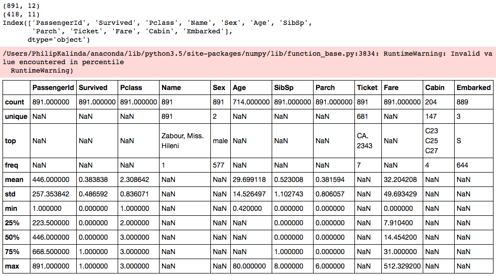
The pandas DataFrames method .describe() is a very useful tool to gain some high level descriptive statistics in order to get a feel for the data and quickly identify areas in the data that you may have to clean up before doing anything else with it. Just by looking at the descriptive stats, I can quickly identify areas that need work, confirm feature properties and understand the dataset more.
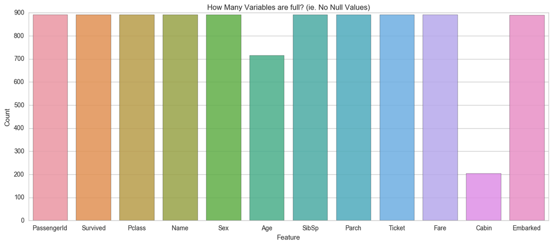
This table shows us that the PassengerId and Name fields are unique to each passenger, confirming that there are no duplicate passengers that I need to clean up or consider. We can also see that Survived, Pclass, Sex, Name, SibSp, Parch, Ticket and Fare are all fully populated with no missing values. However, we can see that Embarked, Cabin and Age have missing values within them. The graph above shows which columns are filled with data and which ones aren't.
Data Structure
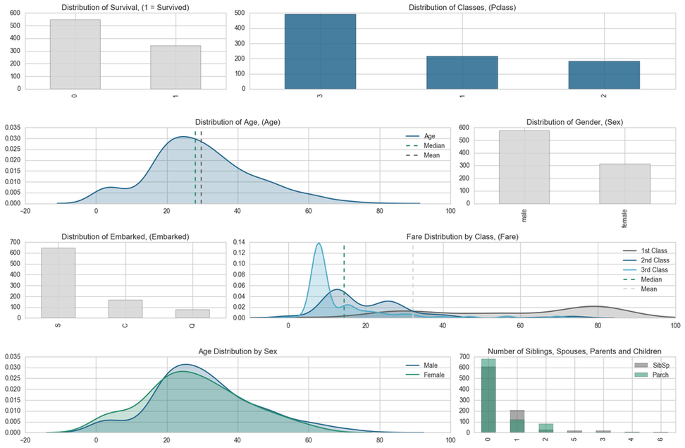
Some interesting bits of information we can quickly see from the descriptive table is that the "Survived" column is fully populated and we can see that only 38% of people on board survived. We can drastically see the difference in survival rate with the visualisation below.
We can also see that there were far more people in 3rd class than in 2nd and more in 2nd class than in 1st class. This is expected and standard in most cases.
The descriptive stats do show that there are only males and females on board and that there are more men than women on board.
The Age column shows us that the average age of passengers on board is 29.7. with a max age of 80 and a minimum age of 0.42! Already we can see that that's quite a large range, however interquartiles were not calculated due to missing data. I will have to deal with this missing data at some point during the cleaning.
The SibSp feature shows us that approximately 1 out of 2 people on average had either a spouse or a sibling on board. This may be useful later to engineer features.
However, the Parch feature shows that approximately 1 in 3 people have either a parent or a child on board. This may come in handy later in feature engineering too.
The Ticket feature is extremely messy as shown with the sample data at the top and the descriptive stats show that there are 681 unique values within the feature throughout the set. I would suspect that this may be down to the family sizes. Maybe some tickets were purchased in family groups.
The Fare feature is fully populated and shows that the average Fare is 32.20 however, the median is only 14.45 and the 75th quartile is 31.00! With the maximum value as 512.33, this suggest that the data is skewed and the mean is sensitive to the outliers. There are also Fares with a value of 0 which may require more analysis. You can also see that there is a large skew in fare prices by class. In order to maintain a decent looking visualisation, I have capped the Fare's at 80. THis shows that the majority of the 1st class tickets are greater than or equal to 80. The 2nd and 3rd class fares are fairly simliar. The majority of the 3rd class tickets are valued at les than 10 whereas there are 2 peaks in 2nd class, at circa 15 and 25. This could be a result of some 2nd class tickets having cabins.
The Embarked feature shows that there are only 3 unique variables as confirmed from Kaggle's data description mentioned above and the most frequent occurrence is "S" indicating that most people embarked at Southampton
Survival
Let's have a look at how each of the features look against survival. That's the main thing that we are interested at looking at; the survival of passengers.
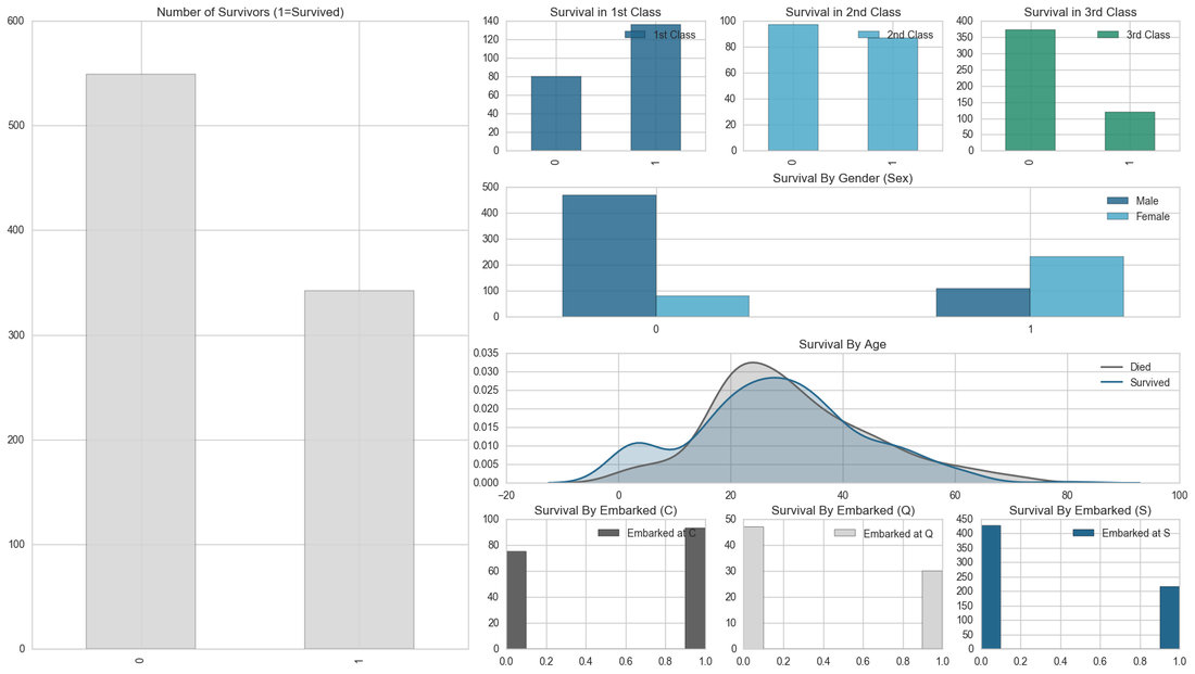
Here we can see on the left the overall survival rate. As seen before, there are fewer survivors than those who perished on the titanic.
Looking at classes, we can see that in 1st class there was a higher survival rate than the other two classes. 2nd class seems to have an even distribution of survivors and deaths. 3rd class has the lowest survival rate with a drastic difference between deaths and survivals.
Survival by gender shows that more male passengers perished than females. This also shows that the survival rate amongst the female population is higher than the male survival rate.
Survival by age shows that there was a higher rate of survival of people aged between 0 and 10. This could be due to the "Women and Children first" policy when the titanic was sinking. There is also a peak of deaths between 20 and 30 of deaths. This could be down to the simple fact that the average age of the population is 29 and the death rate is much higher on average.
Looking at where passengers embarked from, we can see that there is only a minor survival advantage for people that embarked from the Cherbourg port. Whereas the remaining ports, Queenstown and Southampton follow the same trend as the overall survival rate.
Feature Engineering
The raw features gave us some great insight into survival rates. This may also give us a bit of insight into engineering features that can help our analysis and perhaps our predictions. Let's dive into engineering some features!
Family Size
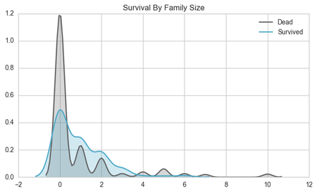
Maybe we can reveal some trends by looking at the family size. If someone is travelling alone, following the "women and children" first policy, the theory is that they would be less likely to survive. If travelling within a family with children and women, then as a male member of that family, you may be able to tag along with your family in order to survive. Looking at the graph below, people travelling alone tend to die more frequently than people travelling in groups until the family size reaches 4+ members. This could be due to the fact that people in bigger families spent more time trying to find family members and not enough time evacuating the ship.
Cabin Block
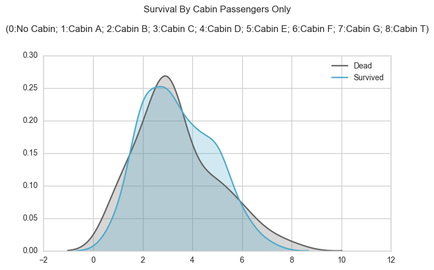
Looking at the Cabin feature, perhaps the cabin location can have an influence on the survival of the person. The Cabin feature is sparse due to passengers that do not have cabins. There are far too many cabins to treat them individually, therefore, this can be broken down by block. The Cabin feature is structured as YXX where Y is the block and XX is the number cabin within that block. Looking at the distribution of survivors and deaths of passengers that owned cabins, there isn't much difference in the survival rate.
Name Length
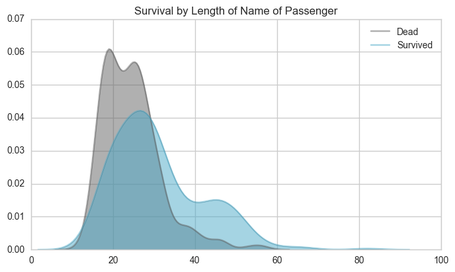
The Length of the name of the passenger may indicate more prestige passengers which may be allow them to access the lifeboats easier than other passengers. Looking at the graph below, we can see that at the name length of >30 letters, the survival rate was substantially higher than that of the passengers with shorter names (<30 letters). Lets look into this a bit more!
Title
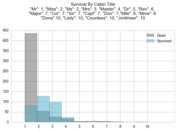
Name Length seemed to have confirmed our theory about prestige, perhaps we can have a look at the title of the passenger to further confirm this. The title of the passenger may assign prestige allowing them to access the lifeboats . Here we can see groups 2, 3 and 4 had a better rate of survival than that of the other group, whereas group 1 had a high death rate. Group 1 consisted of passengers with the title "Mr". Group 2, 3 and 4 consisted of passengers with the title "Miss", "Ms", "Mrs" and "Master". This coincides with the findings of the rate of survival by gender, where females were more likely to survive than males except for the "Master" title. This seems strange at first but after further investigation, looking at the average age of the "Master" title, this seems to be a title give to children around the age of 4. This partly confirms the "Women and Children first" strategy when escaping the ship. Lets explore the child and adult dynamic.
Age Imputation
Before we look into classing Children, Male adults and Female adults, we need to clean up the age feature due to some of the missing data within the field. I will be using the age feature in order to class the children. Before dealing with the missing data, I concatenate the rows of the training and test dataset. I then use a "classers" list of all the variables that I will use to predict the age feature. I use some of the raw variables as well as the features that I have engineered. I then use an ExtraTreesRegressor with 200 trees to predict the age of the rows that don't have ages. I then assign these predictions to the final dataset.
Male Adult, Female Adult, Child
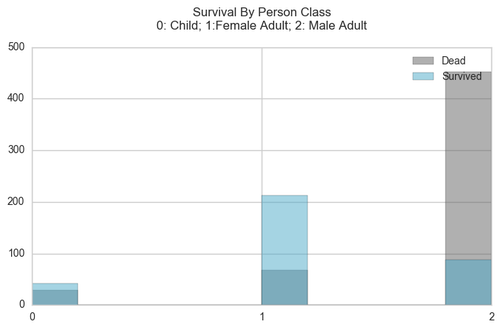
By assigning a child age at 14, we are able to separate children from the passengers and see how the Male Adults and Female adults fare. Looking at the graph below, we can see that the child survival rate was higher than that of the Male adult population, however the Female Adults had the best survival rate.
Other Feature Engineering
Before generating predictions, I went into generating a few more features around grouping families. I created family ids in order to group family sizes into categories more accurately than family size. I also built features around surviving mother and perishing fathers present with the family in order to determine whether a family's survival is dependent on those factors.
Correlogram
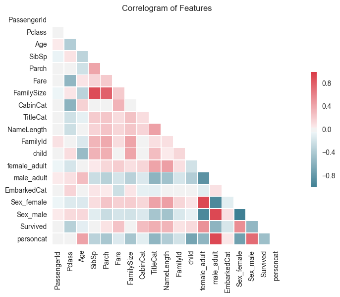
Here I can have a look at the Correlogram of all the features in order to understand how each of the variables vary with each other. This shows us that there are 5 features that are highly positively correlated with survival. These are "female adult", "Sex_female", "NameLength", "TitleCat" and "CabinCat". 3 of these are due to the gender of the passenger. There are 3 features that are highly negatively correlated with survival, 2 of which are related to gender as expected and the other is the class of the passenger. The higher the class (1st Class - low number) the more likely the passenger is to survive. There are also a number of other interesting trends highlighted in the correlogram which can be used to generate new features.
Making Predictions
After running a number of models, I found that the random forest gained the optimal result. I chose to run 30000 trees as optimising my script wasn't my main concern. This was run in the Kaggle kernel in under a minute. I chose to increase the number of samples in the leaves in order add generalisation to the model. Looking at the overall data, we saw that there were more deaths than survivors, therefore I decided to weight the classes in favour of deaths so that higher probabilities would be required in order to confirm a death otherwise, it would be safer to assume they died. This is confirmed by Kaggle's, default submission that assumes that everyone dies which performs better than a 50/50 split. The test set that I used to evaluated the model averaged at around 83%-85%. I used classification metrics in order to validate the model, mainly the accuracy score.
Model Importances
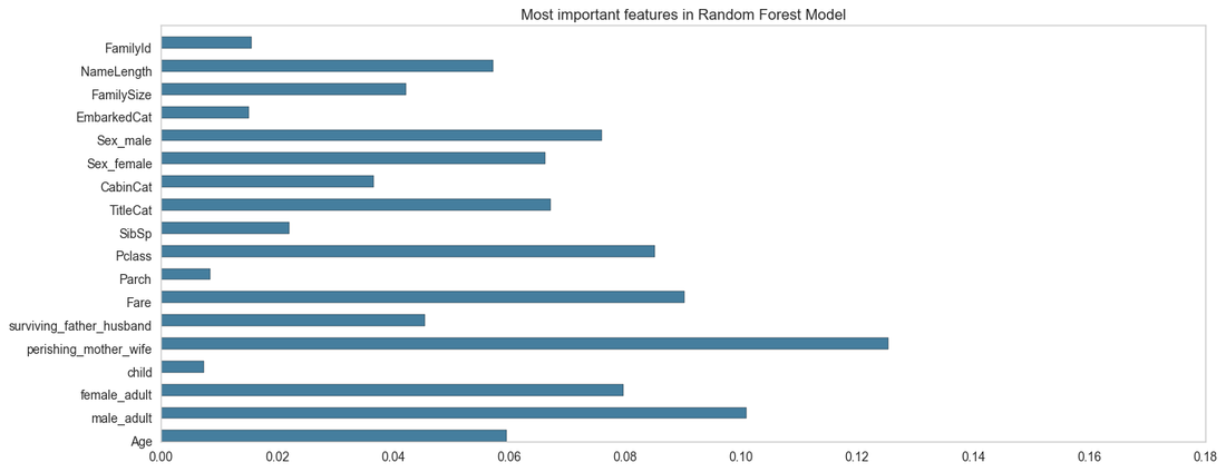
Here we can see the most important variables used within our Random Forest Model.
The Perishing mother variable has been identified in the model as the most influential in determining survival of passengers. Whereas, the Number of parents or whether they are a child are viewed as less important. It has identified features pertaining to gender, class and prestige as the most useful features in predicting survival.
Conclusion
There are a number of ways in which the model can be improved. I could test more parameters, I could look to engineer new features that could perhaps be better predictors. The correlogram had a few interesting trends that could be further investigated in order to reveal confounding variables or create new more complex predictors. I could also add some noise to the perishing_mother_wife in order to generalise the model more and reduce overfitting and lower it's importance slightly in the model.
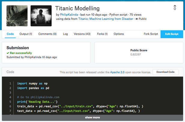
I was happy with my submission and decided not to dedicate any more time to it, as it is just an introductory dataset. I managed to place in the top 3% (116th) with a score of 0.82297 which was good enough for me! I look forward to participating in more Kaggle competitions.
I was happy with my submission and decided not to dedicate any more time to it, as it is just an introductory dataset. I managed to place in the top 3% (116th) with a score of 0.82297 which was good enough for me! I look forward to participating in more Kaggle competitions.
I have also added the full script to my kernel so that you can fork it, should you wish to use it or build on it! Let me know if you do! Thanks!
Please use the comments section below to let me know how YOU would go about the analysis or any improvements that I could do in order to improve my score! All feedback is welcomed! :) Thanks once again!


