Description
In this analysis, I begin to explore the infamous iris dataset. This dataset is famous in the machine learning world to help develop skills in machine learning techniques. This dataset can be approached in a number of different ways and this will depend on your objectives when starting out your analysis. I shall highlight the objectives later in the analysis. Let’s just describe the data so we know what we’re dealing with.
The dataset consists of 50 samples of three different species of iris flowers (Iris Setosa, Iris Versicolor and Iris Virginica). Five features are captured in the dataset. These are:
· Sepal length (cm)
· Sepal width (cm)
· Petal length (cm)
· Petal width (cm)
· Species (cm)
If you would like to read more on the dataset, how it was put together and a bit more history on the data, Wikipedia provides a good recant of the origins of the dataset and components.
Objectives
To be efficient in our analysis, it’s important to set a scope and objectives prior to running any analysis with a few research questions to guide us, otherwise you can get lost in the data and veer off into other analyses that may not add value to your initial goal. Objective is pivotal to success and so I have outlined a few below:
1. Check for identifiable clusters in the data
2. Assess the accuracy of these clusters based on species
3. Build a model to predict the species of samples
4. Asses the accuracy of the model’s predictions based on actual species
5. Assess the model’s ability to predict each species
6. Assess the accuracy of the model to predict out of sample data
Research Questions
There are a number of research questions that I will also be looking to answer as I look to fulfil my objectives. These are as follows:
1. Which of the two approaches are more accurate?
2. How do each of the variables interact with each other?
3. How do each of the variables influence the prediction of the species?
4. Which species is easiest to predict? Why?
5. Which species is the hardest to predict? Why?
1. Which of the two approaches are more accurate?
2. How do each of the variables interact with each other?
3. How do each of the variables influence the prediction of the species?
4. Which species is easiest to predict? Why?
5. Which species is the hardest to predict? Why?
Admin & Imports
Just a bit of admin and housekeeping before we start. These are all the imports that we'll be using throughout the script. Sklearn is THE go to package when considering to do any machine learning in python. Pandas is a great data-frame management package allowing for a number of useful functions on a set of data. NumPy is the go to for linear algebra and has some useful functions and methods. Matplotlib is the go to package when looking to construct visualisations. Seaborn makes those visualisations very compelling with great aesthetics.
With that set out, it’s time to dive into the data!
With that set out, it’s time to dive into the data!
Clean & Prepare
Firstly, a bit of data cleaning is required. Once the data has been into a dataframe, the frame needs an additional column to add a species label so that each row can better identified to a species that just using the species id number. This is done with the use of a simple custom function (“species_label()”) as shown.
Describe
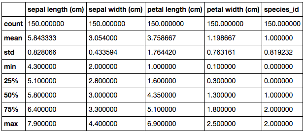
In order to effectively approach this dataset and begin to pave the way as to which direction to go, one of the recommended things to do is run simple descriptive statistics on the data. This is simple to execute but still yields a wealth of value. With this being the case, once run, this is what’s returned.
This table summarises all the numeric columns in the dataset. It is particularly useful for gaining a general sense of the data and how it is structured. For example, looking at the range and interquartiles, we can quickly identify that petal length is the widest varied variable and sepal width is the least varied variable. This may be useful information when approaching the modelling stage in understanding how each of the variables contribute to the predictive power of the model.
Pivot
The basis of our analysis is centred around the species. To develop an understanding as to how each of the variables behave based on their species, we can produce a pivot table with their means.
We can deduce from this table that on average, Setosa petal lengths and widths are much smaller than that of Versicolor and Virginica. Though Virginica do have the biggest petal dimensions on average. We can see that on average, the sepal lengths are quite close in size, however, Setosa have noticeably bigger sepal widths than the other species. This pivot tells us that the Setosa species have some distinctive features.
Correlation
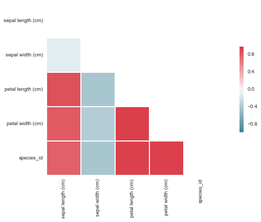
Another way of developing a deeper understanding of the variable dynamics is with the use of a correlation table. This table identifies trends between variables and assigns a number between -1 and 1, dependant on the strength of the relationship. It is important to note that this table merely identifies trends and doesn't identify the cause for those trend nor imply that one variable impacts another.
This table shows that there is a strong linear relationship between all the variables except sepal width, which is much weaker and also negative. This may be useful information at later stage. Looking at the correlation table, we can see that in relation to the species_id, there are 3 main variables (sepal length, petal length and petal width) that have a strong linear relationship. These variables are likely to be strong variables in predicting the species of a given iris flower.
Visuals
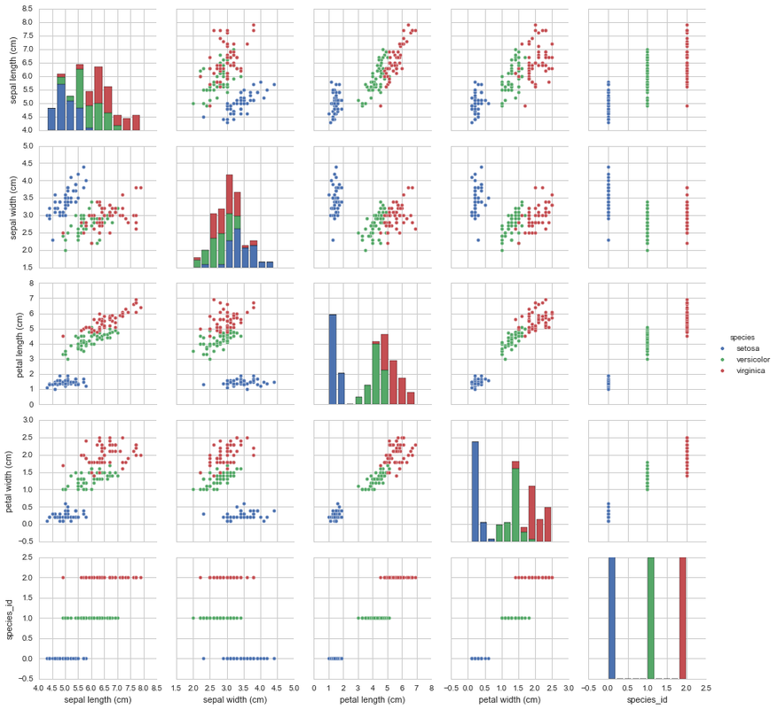
Now that we have a feel for the data in a numeric sense, let’s have a look at the data from a visual perspective. Let’s plot each of the variables against each other. Seeing as there are only 5 numeric columns, this plot shouldn’t be big. To stick with the theme of species, we can colour code each data-point by their respective species.
This shows us that the species are quite well separated into clusters based on their measurements. This is the case with all the combinations except when plotting sepal length and sepal width. These are slightly more difficult to separate. Whilst the Setosa species in this graph is less clustered as it’s other graphs, Versicolor and Virginica are quite well mixed together here making it much more difficult to tell one group from the other individually.
Here is a visual representation of the correlation matrix mentioned earlier. This makes it abundantly clear that sepal width is very different to the other variables which tend to vary in union with a strong positive linear correlation.
K-Means Clustering
The previous visualisation told us a lot about the data and suggests that similar species cluster together when looking at the dimensions of their petals and sepals. Let’s explore that! The clustering technique used to explore this will be K-Means clustering. K-Means, in my own words, is a branch of unsupervised machine learning. Just to explain, unsupervised machine learning is a branch of learning that focuses on identifying trends and patterns in data, and is generally used to explore datasets. K-Means specifically focuses on setting K number of clusters. How each point is assigned to a cluster is based on its Euclidean distance to the centre of each cluster point. Data-points are assigned to the closest cluster. Once all points have been assigned, you should have data points with similar characteristics together in each cluster. You can have as many clusters as you need, depending on your objectives, however, the more clusters, the less likely you are to make generalised assumptions about the data. Seeing as we have 3 species, let’s try to use 3 clusters with the data’s sepal and petal dimension and see what that looks like!
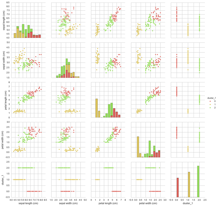
K=3 K-Means
This pairplot looks very similar to the previous one. This could be good because that would assume that it has clustered the data in a similar fashion to the species labels but only by using their sepal and petal dimensions. Let’s have a look at how well the K=3 K-Means clustered the samples against their respective species.
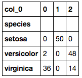
This shows that Setosa was perfectly grouped, however, Versicolor and Virginica both have a number of inconsistent groupings. This most likely is due to the sepal width of both species being relatively indistinguishable when compared to the sepal length. Perhaps if there were more clusters, they could help break down the areas that are mixed between the two species and their dimensions. Let’s try 32 (=9) clusters and see what interesting things we can find (note: I have not used any mathematical methods for deriving the number of K, I have chosen just what feels right).
K=9 K-Means
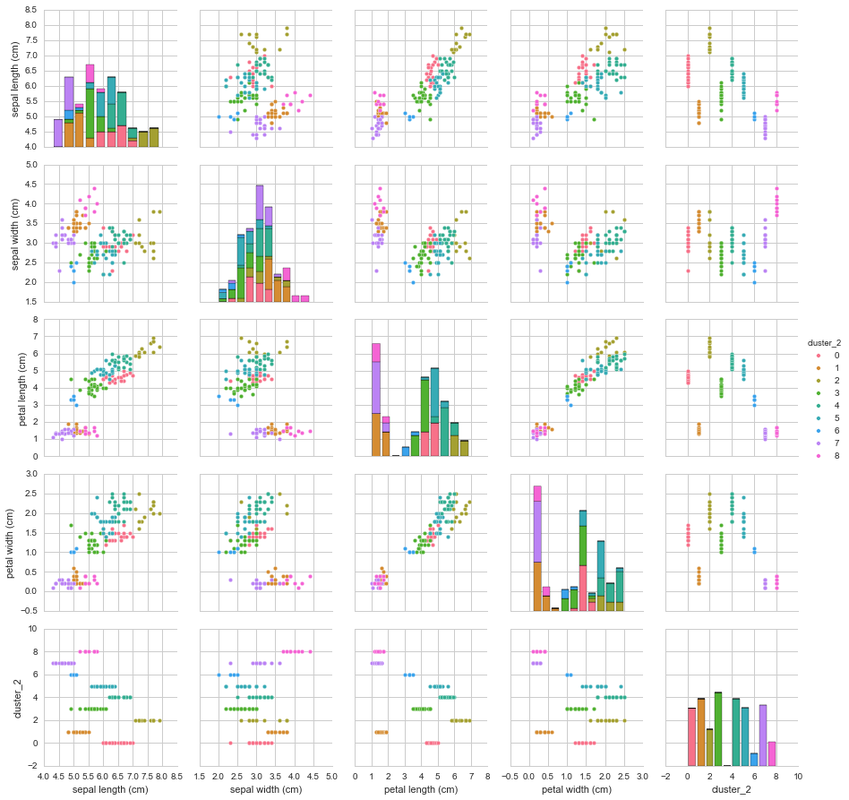
This pairplot is slightly harder to compare against the original plot and colour by species, however, you can see that there are a number of distinctive clusters that cluster together. Let’s have a look at how well the K=9 K-Means clustered the samples against their respective species.
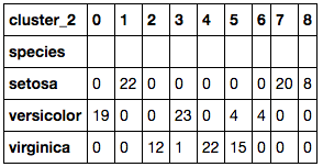
The K=9 K-Means clustered the data much better than the previous K=3 K-Means cluster. The number of incorrectly clustered samples are much fewer than that of the previous cluster. By choosing the species with the most counts in the cluster as the assigned species cluster we can add up all the clusters together and see how many were incorrectly clustered using the species as a reference.
One effective way of comparing model results, would be to calculate the accuracy of each model. To do this you would add all the correctly predicted observations and divide it by the total number of observations (ie. Correctly predicted + incorrectly predicted). When we do this, we see that K=3 K-Means cluster had an accuracy of 89.33%. When calculated for the K=9 K-Means cluster, the accuracy was rated at 96.67% which is better!
Multi-Class Logistic Classification Modelling
Let’s have a look at building a model that can predict which species a given iris flower based on their petal and sepal dimensions. We need to build a model that can take a number of given inputs and produce an output which will tell us what species the flower owning the provided input variables. This branch of machine learning is called supervised machine learning.
This is a branch of machine learning that focuses on training an algorithm to predict an unknown variable from known variables. The unknown variable that we will be predicting is the species of the iris flower. The algorithm that we will be training is a Logistic Regression.
Since we will be attempting to predict the species of flower which is a finite list of categorical options (ie. Setosa, Virginica, Versicolor), we need to assign a numerical value for each of the species within dummy variables. Dummy variables are variables that take binary (True=1, False=0) assignments based on every category in a given column. For example, our categories are Setosa, Virginica and Versicolor. We will have a column for each of these species and will assign a 1 or 0 for each row depending on what species they are. So a sample row representing Setosa, will have the Setosa column value of 1 and the Virginica and Versicolor values would be assigned as 0.
Here, the dummy variables are easily created and concatenated to the main data thanks to pandas’ really useful methods.
The way a Logistic Regression works is very similar to a linear regression in that it takes a number of inputs to provide an output, however, the output is where the difference lies as it uses the logit transformation which is a mixture of both an exponential transformation and a normalisation transformation. Logistic Regression is a classification model that outputs the probability of you being in a given class. The threshold for determining which probability should be assigned a positive or negative return is defaulted to 0.5 and can be adjusted depending on your requirements. This is also known as the discrimination threshold.
These models are focused around binary outputs. In our case, we have more than two outputs; we have 3 species to account for. So to do this, we will have to build 3 separate models for each of the different species. Each model will predict the chance of a given input being classed as that species or not. For each row, every model will calculate their probability and the highest one of the 3 will be the selected species for that row. Let’s build the models!
The models have been made and trained to the whole data set and this is how they are set up. They have been grouped into a dictionary so that they can be accessed through a loop and they are stored away safely.
Lets have a look at the model coefficients in order to determine how each of the variables affect the dependant variable, in ur case the probability of being in any given species. Here we can see the effect each increase in dimension has to the probability of being classed in the respective species. Every coefficient (k) represents the effect (+ve or -ve) for every 1 unit increase in the variable they're assigned to towards the dependant variable.
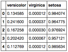
Here we calculate the probabilities for each of the models so we can determine which row belongs to which species according to the model with the highest probability.
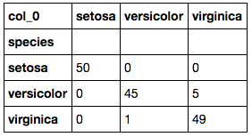
Here we need to select the largest value in each row and take the column index name so we know which species the model predicts it is most likely to sit. This table shows us how the predictions compare against the actuals.
The accuracy of this model can be calculated in the same way as the previous K-Means models. This calculation results in a 96.00% accuracy! That is only 0.67% lower than that of the K=9 K-Means model.
Let’s look a bit deeper into each of the models used to make these predictions in order to assess their accuracy.
The two most popular metrics used in the assessment of classification models are the model’s True Positive Rate (TPR) and False Positive Rate (FPR). The True Positive Rate provides insight into the model’s ability to correctly assign positive results. This is also referred to as the model’s “sensitivity”. The False Positive Rate provides insight into the proportion of results that we predicted positive when they were in fact negative. This is also referred to as the model’s fall-out.
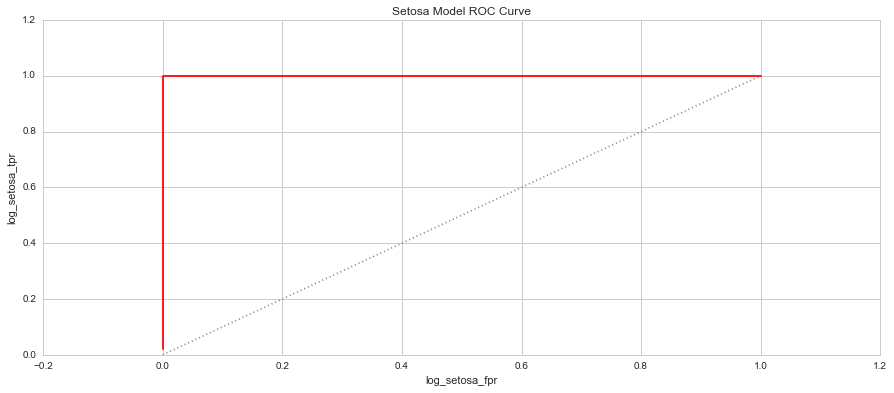
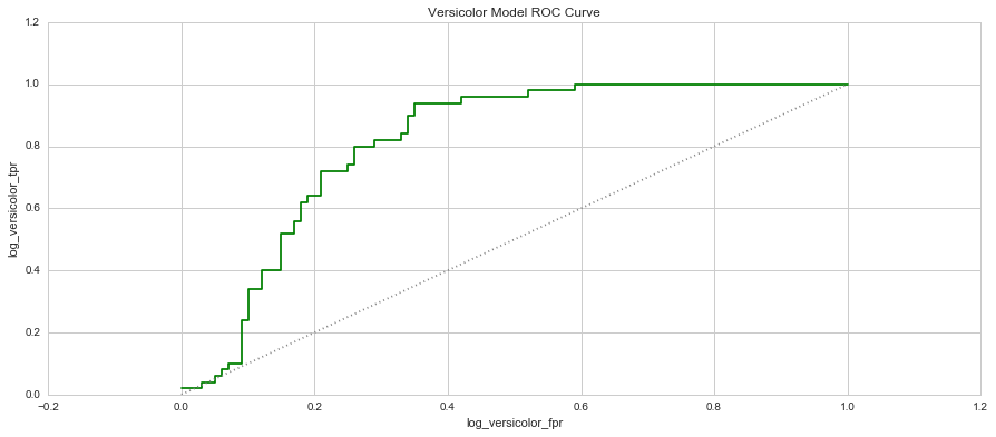
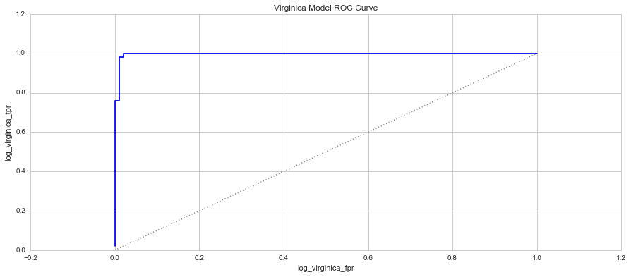
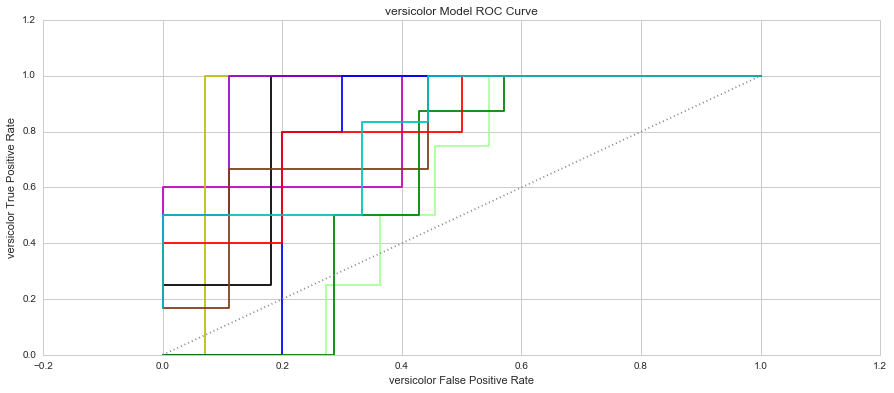
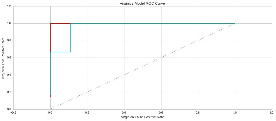
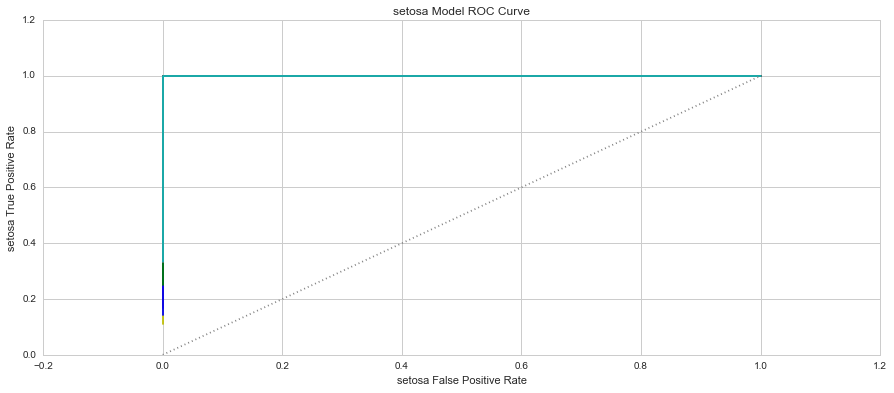
When you plot these two measure against each other, this produces a graph known as the Receiver Operator Characteristic (ROC) Curve. This curve allows us to understand a classification model’s performance as the discrimination threshold is varied. Even more so, the area under the curve describes the probability that the classifier will rank a random positive observation higher than a random negative observation. This is known as the AUC Score (Area Under Curve). Let’s have a look at the 3 models’ ROC Curves and what they could tell us about each model.
In each graph, the grey dotted line indicates the same probability as guessing (ie. 50 / 50).
K-Fold Cross Validation
These models were built off of the entire dataset and may well be subject to overfitting. Overfitting occurs when a model is only good at predicting the data against which it was trained and the algorithm doesn’t provide a generalised enough solution that could be applied to unseen data. Overfitting is a problem if you are building your model to make predictions on data that it has never been trained on. To overcome this major challenge, we will use cross validation technique called K-Fold cross validation.
Cross validation overcomes overfitting by sub-setting the data into a training set and a test set. In doing this, the models are trained on the training set and then tested using the test set which would represent the unknown data which the model is attempting to predict on. K-Fold cross validation is basically repeating the process of cross validation K times. Each iteration would have a different training and test set. After this is run K times, the average accuracy and metrics are taken and carried forward as the final accuracy and metric for the modelling technique.
Cross validation overcomes overfitting by sub-setting the data into a training set and a test set. In doing this, the models are trained on the training set and then tested using the test set which would represent the unknown data which the model is attempting to predict on. K-Fold cross validation is basically repeating the process of cross validation K times. Each iteration would have a different training and test set. After this is run K times, the average accuracy and metrics are taken and carried forward as the final accuracy and metric for the modelling technique.
Here the cross validation technique mentioned before is executed using K = 10 folds. This means the modelling, prediction and scoring process was run 10 times. A total of 3 * K=10 (30) models were built and tested.
The graphs show that the Setosa Models were consistent in predicting which of the samples were of the Setosa species. The average AUC score for the Setosa Models was 100.00%. The Virginica Models only had one Fold where the model had a slight issue in predicting the correct species, however, the average AUC Score was 99.63%. The Versicolor Models had the most issues in predicting the species of each sample with AUC Scores ranging from 59.09% to 94.44%. The average AUC score for the Versicolor models was 80.04%. Based on the AUC Scores, the best performing group of models was group 3 with AUC scores of Setosa-100.00%, Versicolor-94.44% and Virginica-100.00%.
The graphs show that the Setosa Models were consistent in predicting which of the samples were of the Setosa species. The average AUC score for the Setosa Models was 100.00%. The Virginica Models only had one Fold where the model had a slight issue in predicting the correct species, however, the average AUC Score was 99.63%. The Versicolor Models had the most issues in predicting the species of each sample with AUC Scores ranging from 59.09% to 94.44%. The average AUC score for the Versicolor models was 80.04%. Based on the AUC Scores, the best performing group of models was group 3 with AUC scores of Setosa-100.00%, Versicolor-94.44% and Virginica-100.00%.
Conclusion
Upon conclusion of our analysis, we are now able to assess our level of completion for each of our objectives and answer the research questions that prompted a number of analyses.
Objectives
1. Check for identifiable clusters in the data - We were able to use K-Means clustering to identify patterns and the algorithm tended to group the data based on their species.
2. Assess the accuracy of these clusters based on species - We were able to assess the accuracy of the clustering methods by looking at the number of correctly categorised data points against the whole population.
3. Build a model to predict the species of samples - We were able to build a predictive model to determine the sepcies of iris flower. This was a Logistic Regression Model. We built one for each species and used a One Vs All approach.
4. Asses the accuracy of the model’s predictions based on actual species - We were able to assess the accuracy of the models using the same approach as we did the clustering methods.
5. Assess the model’s ability to predict each species - We were able to achieve this objective by diving deeper into each species model and calculating each of their AUC score.
6. Assess the accuracy of the model to predict out of sample data - We were able to asses the model's accuracy on out of sample data by simulating this with a K-Fold cross validation technique.
We are also in a great position to answer all the research questions due to our discoveries in our analyses.
Research Questions
1. Which of the two approaches are more accurate? - Having used appropriate accuracy measures, we can conclude that the K=9 K-Means cluster was the most accurate classifier with an accuracy score of 96.67%.
2. How do each of the variables interact with each other? - We've been able to identify relationships between the variables with the use of a correlation matrix which enabled us to identify that 3 out 4 variables are highly correlated to each other and the species id.
3. How do each of the variables influence the prediction of the species? - We have looked at the coefficients of each of the models used in order to determine this.
4. Which species is easiest to predict? Why? - Based on each of the model's ROC curves, and the K-Means models, the easiest species to predict is Setosa and this is due to the species' distinctive features that are so disparate from the remaining two species.
5. Which species is the hardest to predict? Why? - The hardest species to predict based on the ROC curve and AUC scores is the Versicolor species. Their attributes are very similar to the Virginica species, making it quite difficult to distinguish them from each other. This is clear in some of the pair plots and clusters where there is a fair amount of overlap even in the K=9 K-Means cluster. The Versicolor Species is also loacted between the two species, making it harder to define a range between the two species that doesn't fall into either other species


