
Description
Finding the perfect place to eat in town can be difficult. With a wide range of restaurants and multiple factors influencing your choice, It seems almost impossible to pick the best place for you! With the use of Multi-Criteria Decision Analytics like TOPSIS and VIKOR methods, I make that decision easier and find the perfect place to have a steak in Leeds (personal favourite meal).
Data Sourcing
In order to pick the best place, I need to collect as much data as I can about each of the options. I need to collect data that could be relevant to my analysis otherwise collecting anything more may just cause more issues with manipulating the data and slow the analysis down by distracting focus to irrelevant variables.
In order to rate the restaurants in certain criteria, trip-advisor was accessed. Information regarding food quality, service and atmosphere were extracted from the site. An overall rating from previous customers have been normalised and aggregated and averaged to give an accurate rating of the restaurant.
The websites of each of the restaurants were accessed to determine an average price for a meal as well as whether there was steak available, seeing as those places would be given preference as a personal favourite meal.
Google Maps was used to determine the distance needed to travel to each of the locations from the University of Leeds. Doogal was used to convert the postcodes from google maps into geolocations (Longitudes and Latitudes) for visualisation purposes.
Multi-Criteria Decision Analytics (MCDA)
In order to determine which restaurant is the best choice I have decided to use Multi-Criteria Decision Analysis techniques. These are suitable when attempting to make a decision between a number of options with differing values in specific criteria.
The techniques I decided to use are TOPSIS, VIKOR and the weghted sum method. Below is a brief description of each of the methods:
TOPSIS - Technique for Order of Preference by Similarity to Ideal Solution is a multi-criteria decision analysis method is based on the concept that the chosen alternative should have the shortest geometric distance from the positive ideal solution and the longest geometric distance from the negative ideal solution.
VIKOR - The VIKOR method is a multi-crieteria decision analysis method developed to solve decision problems with conflicting non-commensurable criteria, assuming that compromise is acceptable for conflict resolution, the decision maker wants a solution that is closest to the ideal, and the alternatives are evaluated according to all established criteria. VIKOR ranks alternatives and determines the solution named compromise that is the closest to the ideal.
Weighted-Sum - this is a multi-crieteria decision analysis method that is developed by assigning value to each alternative based on the weightings of importance and their value add. The sum between the weighted values are added up and the alternative with the greatest value is selected as the optimal solution.
All these methods have their benefits and limitations however, I decide to consult all three methods and take an average of the three scores in order to get a well-rounded answer. To support this analysis, Trendlines were also calculated in order to determine whether the restaurants are gradually losing ratings or being rated higher over time.
Below are some Visualisation to help illustrate the findings of the analysis.
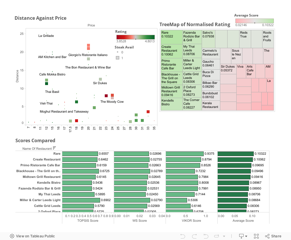
Ratings Dashboard
This is a dashboard created using tableau. The first graph plots the average price of a meal against the distance required to travel from the University of Leeds. The colour scale shows the ratings each of the restaurants have by previous diners. The size of the points indicate whether or not the restaurant has steak available on the menu. This visualisation is able to display 4 dimensions all in one visual.
The second visual is a TreeMap using the normalised average of each of the restaurants after having used 3 ranking methods (VIKOR, TOPSIS and Weighted Sum). With the use of the sizes of each of the boxes, you are able to see which restaurant is better than another. This information is reinforced with the use of a colour scale.
The final visual shows the results of each of the ranking methods and the averaged result so you are able to see how much each method influenced the final averaged result. This is displayed as a horizontal bar graph.
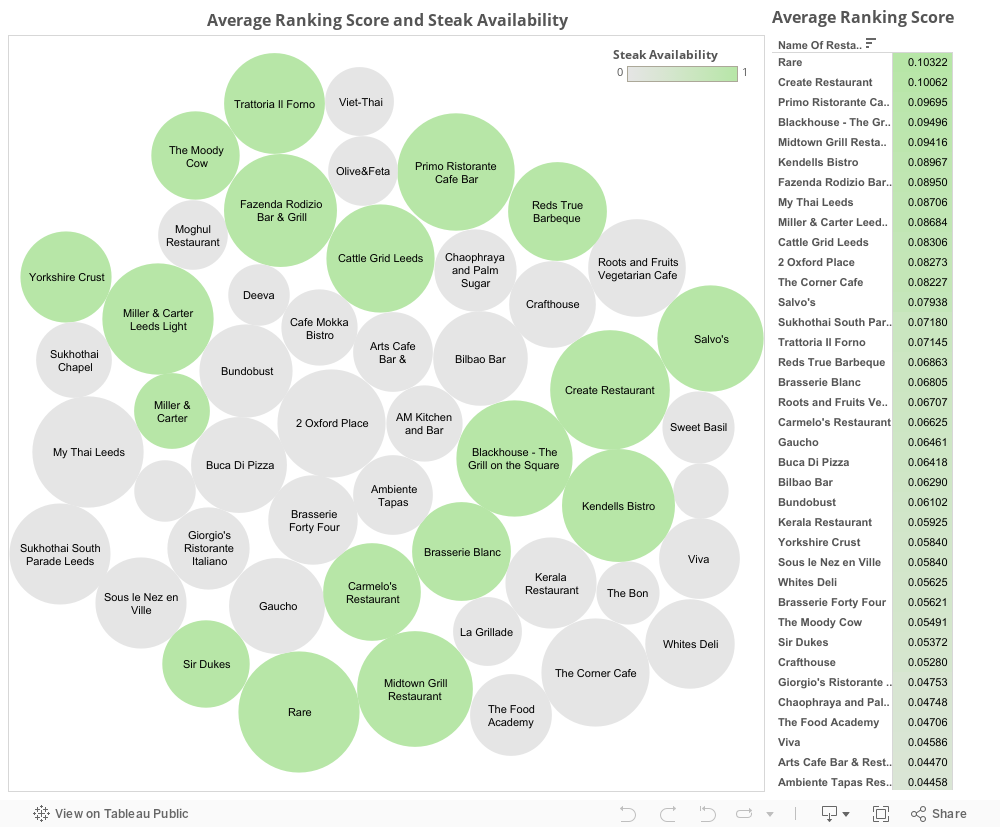
Bubble Dashboards
This dashboard created by tableau shows all the ratings of each of the Restaurants.
The first visual is another way of showing the same information as the TreeMap above with an added dimension. The added dimension is the Steak availability which is distinguishable by the colour code system used. The results of the analysis are also shown on the left of the graph. You are also able to view each individual restaurants score by highlighting individual bubbles.
The first visual is another way of showing the same information as the TreeMap above with an added dimension. The added dimension is the Steak availability which is distinguishable by the colour code system used. The results of the analysis are also shown on the left of the graph. You are also able to view each individual restaurants score by highlighting individual bubbles.
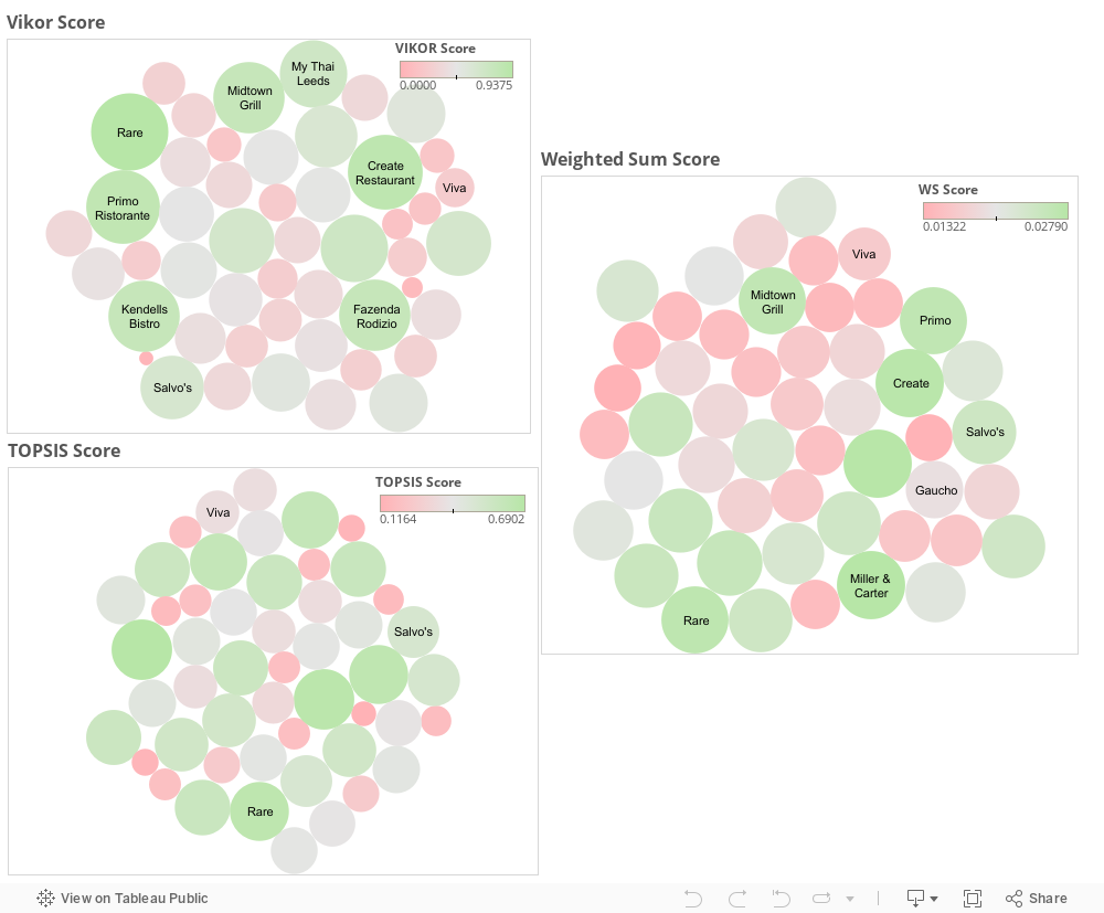
Ranking Bubble Dashboards (VIKOR/Weighted Sum/TOPSIS)
This visualisation shows the individual ranking methods' results with the size and colour of the bubbles determining their results.
Locations with Average Score on Hot & Cold Scale
This Visualisation is constructed by CartoDB, an online resource used to visualise spatial data.
The visualisation shows the average rating of each of the restaurants using a hot-cold scale with the highest ranking restaurants are red (Hot) and the lower ranked restaurants are blue (cold). It also shows the origin of travel, University of Leeds, to help visualise the distance required to travel.
The visualisation shows the average rating of each of the restaurants using a hot-cold scale with the highest ranking restaurants are red (Hot) and the lower ranked restaurants are blue (cold). It also shows the origin of travel, University of Leeds, to help visualise the distance required to travel.
4-Months Reviews - Spatial Visualisation
This visualisation, constructed using CartoDB, shows the ratings customers have of each restaurant over a 4 month period. With green indicating a high rating and red indicating a low rating. This enables the viewer to identify trends in reviews over time and provide insight into whether location has an effect on the rating of the restaurant.
This visualisation also enables you to view which of the restaurants offer steaks. You are also able to view specific dates and how they were rated in order to develop insights about restaurants.
This visualisation also enables you to view which of the restaurants offer steaks. You are also able to view specific dates and how they were rated in order to develop insights about restaurants.
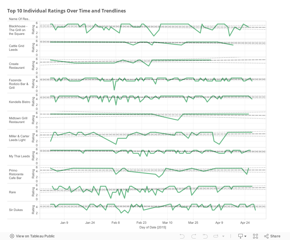
Top 10 Ratings Over Time and Trendlines
This visualisation, constructed using Tableau, shows how customers have been rating the top 10 restaurants within a 4 month period. This allows you to see whether there are common dips in performance within specific dates or if some restaurants are maintaining a constant level of performance. The trendlines accompanying the visualisation allows you to determine whether there is an underlying positive or negative trend in the way people are rating the restaurants which could reflect the quality of service over time.
Conclusion
To conclude, following the analysis, the best restaurant to choose would be Rare! The distance isn't too far from the university, the pricing is decent in comparison to other restaurants and the wide selection of steak make it a great candidate in the analysis. The overall ratings are good and steady throughout trip advisor.
I can confirm that following this analysis, I have eaten at Rare and it was one of the best steaks that I have had. Great to know that the analysis actually provided a great choice! I would definitely go there again! I have also been to a number of those other restaurants and agree with the ranking methods except for one! The one that I wish I thought would have ranked higher is Fazenda. I may have liked the fact that Fazenda is an "all you can eat" steakhouse! that was not factored into the analysis and perhaps may be one of the reasons that it didn't rank higher than I thought it would.
I can confirm that following this analysis, I have eaten at Rare and it was one of the best steaks that I have had. Great to know that the analysis actually provided a great choice! I would definitely go there again! I have also been to a number of those other restaurants and agree with the ranking methods except for one! The one that I wish I thought would have ranked higher is Fazenda. I may have liked the fact that Fazenda is an "all you can eat" steakhouse! that was not factored into the analysis and perhaps may be one of the reasons that it didn't rank higher than I thought it would.
Downloads Available
Full Restaurant Analysis Dataset
https://www.dropbox.com/s/nlqpm0uzejjxhxb/Full%20Restaurant%20Analysis.xlsx?dl=0
Reviews List Dataset
https://www.dropbox.com/s/mhn5n67595l9d7d/Reviews%20List%20Ready.csv?dl=0
All Reviews Dataset
https://www.dropbox.com/s/r4mhjvhiiiwc6ir/Reviews.xlsx?dl=0
https://www.dropbox.com/s/nlqpm0uzejjxhxb/Full%20Restaurant%20Analysis.xlsx?dl=0
Reviews List Dataset
https://www.dropbox.com/s/mhn5n67595l9d7d/Reviews%20List%20Ready.csv?dl=0
All Reviews Dataset
https://www.dropbox.com/s/r4mhjvhiiiwc6ir/Reviews.xlsx?dl=0
